


A colour story can begin with a small collection of references: a drawing, a few swatches, and a sentence describing the intended mood. Presenting those references clearly is a merchandising task in its own right. A buyer needs to understand which colours belong together, which details remain proposals, and what information will arrive later. An attractive presentation should make those decisions easier to discuss.
This article uses a hypothetical collection inspired by a quiet coastal morning. Its palette contains muted blue, warm sand, and an accent drawn from an imagined orange sunrise. Any artwork prepared for this example should be original and illustrative. There is no finished garment, measured colour result, or buyer response behind the example. The aim is to prepare a useful communication package before making claims about a physical product.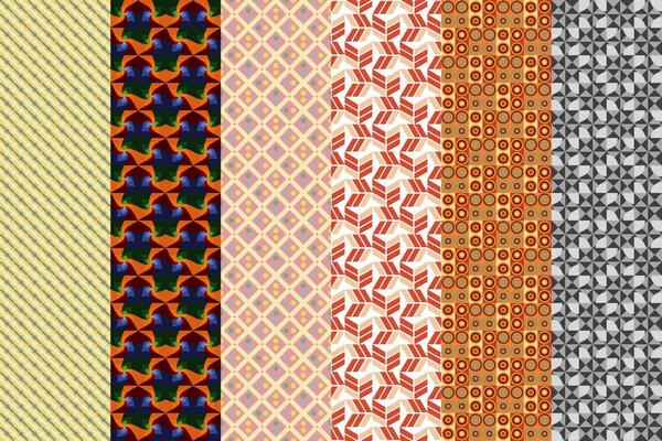
Give each reference a specific job
Begin with three separate components: a palette sheet, a proposed assortment, and a short presentation sequence. The palette sheet identifies the intended colours. The assortment shows how those colours might be distributed across fictional items. The sequence introduces the idea in a chosen order. These components can share a visual style while answering different questions.
A palette sheet might contain three large colour blocks with plain names such as “blue concept A,” “sand concept B,” and “orange accent C.” These labels are working identifiers. They do not describe approved dye recipes or certified colour matches. If a team later adopts physical standards, record their references separately instead of treating screen colours as substitutes.
For the assortment, draw simple original outlines of a tote, scarf, and overshirt. Use the outlines to discuss visual distribution: perhaps blue is dominant, sand is secondary, and orange appears only in a small detail. The drawings communicate a proposal. They do not establish construction, availability, fabric suitability, or the cost of producing those items.
Keep a flat board available for comparison
The flat storyboard is the most useful reference when several people need to comment on the same version. Place the palette, outlines, and a short explanation on one page. Give the page a version identifier and a date. If the accent changes, update the identifier so that a discussion about one colourway does not quietly become a discussion about another.
Leave enough space around the swatches to distinguish them. Keep labels outside coloured areas when that improves contrast. Review a small version of the board, because a readable desktop layout can become crowded inside a message thread or on a phone. Provide a text description of the palette and the proposed distribution for anyone who cannot inspect the image easily.
Where actual fabric photographs are available, place them in a clearly separate section. Identify the photographed item and describe the image honestly. Lighting, processing, and the viewer’s display can affect its appearance. Avoid presenting an illustrated swatch, a photograph, and a physical reference as interchangeable simply because their colours look similar in a layout.
Use a slide sequence to structure the conversation
A short slide sequence can introduce the palette without changing the artwork. Start with the complete board, show the three colour blocks, and then reveal the proposed assortment. End by returning to the complete board. This gives the viewer an overview before asking for a decision and leaves the final frame available for discussion.
Keep each slide focused on one question. The first may ask whether the overall direction is appropriate. The next may ask whether the accent is too prominent. A final slide can list information still needed, such as an approved physical reference or a revised assortment drawing. These questions are more useful than a general request to decide whether the presentation looks good.
A slide format also makes revisions straightforward. Replace a proposed colour block or an outline without rebuilding an elaborate clip. Save the earlier version when its decisions still matter. A presentation history can help explain what changed; it should not imply that the earlier concept was approved merely because it was shown.
Choose authored timing when the order matters
A conventional video editor offers another route. Put the original board on a timeline and add deliberate highlights, captions, or transitions. For example, a caption can identify the dominant colour before a separate highlight draws attention to the accent. Keep the working labels readable throughout the sequence.
This approach suits a presentation with a fixed speaking order. The creator chooses when each element appears and how long it remains visible. That control requires preparation, particularly if labels and artwork need separate layers. It also creates a reason to review the exported file rather than relying only on the editing preview.
Keep animation away from details that carry the decision. A decorative transition should not replace a colour name, hide a proposed item, or change the relative size of a swatch. Offer pause and replay controls where the publication format supports them, and provide the original flat board beside the video. Captions should make the essential explanation understandable without sound.
Treat generated motion as an optional introduction
Image-to-video generation can provide a different kind of introduction: a clearly labelled mood concept based on owned artwork. For example, an image-to-video workflow accepts a starting image and an optional description of the desired motion, with a result that can be previewed and downloaded. That workflow creates a presentation option rather than a colour approval.
For the coastal example, use a separate original landscape illustration without product labels or specification numbers. A restrained movement through the illustrated scene could introduce the collection’s theme. Then show the unchanged palette board in a separate slide. Keeping the mood scene apart from the decision sheet avoids asking generated frames to preserve information that must remain exact.
Review the result for unintended changes in colour, shapes, and objects. Reject a clip that gives a misleading impression of the proposed assortment. Label an accepted scene as an AI-generated mood concept based on an original illustration. It should not be described as footage of a collection, a factory process, or a material trial.
Send a board that invites a precise answer
Before sharing, include the current flat board, the optional presentation, and a short list of open questions. Ask reviewers to identify the version they are discussing. Separate visual preferences from decisions that require actual product information. This allows a buyer or colleague to comment on the colour story without appearing to approve details that have not been supplied.
A useful handoff makes its next step visible: revise the accent, prepare a physical reference, or develop an assortment drawing. The storyboard earns its place by organising that conversation. Motion may introduce the idea, but the stable board and explicit questions should carry the decisions.
Explain the colour board with an optional presenter
For a separate narrated introduction to the colour board, Magic Hour lip sync AI matches mouth movements to an audio track. Use a presenter and voice you have permission to use, review timing, and label the synthetic segment. Keep colour decisions grounded in the original references and provide readable captions; the presenter is an explanatory aid, not a colour approval.
For a separate creative experiment, describe an owned textile-design illustration in a written prompt and explore it with Magic Hour AI video generator. Keep the result labelled as generated imagery, compare it with the storyboard and retain a still alternative; the generated scene is not evidence of a real event or a tested outcome.
Contributor note: Magic Hour provides tools for creating images and videos. This original article was prepared with AI assistance for Textile Merchandising and submitted for editorial review. It describes a hypothetical communication workflow and reports no firsthand test or measured result. The contributor retains copyright; publication permission is nonexclusive.

Mohammad Noor Nabi, known by his author name Noor Ahmed Raaz, is a PhD Fellow at Bangladesh University of Textiles (BUTEX) and the Founder & Editor of Textile Merchandising. He is also an Assistant Professor of the Textile Engineering Department at a renowned university in Dhaka, Bangladesh. His research focuses on textile innovation and sustainability. Awarded the Research & Development Fellowship thrice from the Ministry of Science & Technology in Bangladesh, Noor Ahmed Raaz is dedicated to advancing textile engineering through education, research, and industry collaboration. For inquiries or collaborations, contact Noor Ahmed Raaz via email at textilemerchandising1@gmail.com or WhatsApp at +8801673758271.